The Premier League is finally back, which means one thing, new kits!
Long gone are the days where teams just had two strips, one home and one away, now the majority of Premier League clubs have a third/alternative kit.
The use of a third kit is a contentious one, with many believing that it is unnecessary and is just another example of clubs fleecing fans.
A third kit was originally brought in by teams who wore stripes on their shirt, as a way of making 100% sure they wouldn't have a kit that clashed with their opponents.

Now, 15 of the 20 Premier League teams have officially released their third kit for sale, with Spurs and Chelsea the latest teams to do so.
It is likely all 20 clubs will bring out their third kits for sale before Christmas, but for now take a look at the 15 strips released so far.
AFC Bournemouth

As far as strips go, it's not a bad one, but it's definitely the worst of Bournemouth's three.
But it achieves the brief of making sure that they will 100% not clash with their opponents, would anybody want to?
Arsenal

Obviously if Arsenal and Bournemouth decided to wear their third kits then they would clash, with Arsenal also going for a light green shirt.
We like the shirt, the collar is a nice touch, but we have two questions, since when was Cech an outfield player and also when is the next top 10 album dropping lads?
Brighton & Hove Albion

We don't know how to feel about this one, rather than create a new shirt, Brighton have decided to use their away kit from last season as their third strip.
Yes, it means fans don't need to fork out for a new one, but if you're going to go to the effort of having one, do it properly.
Burnley

If any of our Premier League teams need a third kit this season, it's Burnley.
In the Europa League for the first time, Sean Dyche's men have already played three games in the competition and will hoping for many more to come.
Slight resemblance to Tottenham's famous all white European kits....
Everton

Everton have done really well in the transfer market this summer, but they have also done well in the kit manufacturers too.
The third strip (far right) is an absolute triumph, the retro 'Umbro' pattern rolls back the years for many fans.
Huddersfield Town

Huddersfield sporting their brand new team crest have also gone for a green shirt, but a little more 'hi-vis'.
You certainly will spot them coming, but with the home and away strips donned with stripes, they have acheived the 'brief'
Leicester City

If you look at this strip and you think, didn't Leicester wear this a few years ago, then you'd be almost right.
A quick look back through the archives and you'll see Leicester's title winning season in 2015-16 saw them wear a Puma version of this white number.
Addidas makes it a lot better though to be fair.
Liverpool

Liverpool revealed their third kit when they announced the signing of Switzerland forward Xherdan Shaqiri from Stoke City.
A big smile from the £13 million man, probably because he got away without having to model his new side's purple away kit.
Man Utd

Strangely it is United's away kit that has yet to be revealed, but is rumoured to be pink!
If that's the case, they should seriously consider using their 'midnight blue' alternative kit, it's stunning.
Newcastle United

Newcastle achieve the brief by releasing a third kit that has no stripes and in doing so have created a stunning shirt (far right).
The turquoise kit will surely have a lot of orders from the Toon Army.
Southampton

Not sure Southampton got the memo.
Basically their third kit is their home strip, but they have filled in the white stripes with a slightly darker red.
It's so confusing why they thought this would be ok.
West Ham United

The Hammers debuted their third strip when they visited Anfield on Sunday.
Although Mark Noble and his team mates didn't play all to well in a 4-0 loss, they at least looked smart.
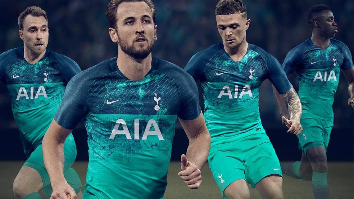
Tottenham Hotspur

After the home and away strips received mixed responses from fans, it was important Spurs got their alternative kit right and they did, just.
In the promotional material, the kit isn't all that, but after Harry Kane and co. wore it against Newcastle on Saturday, it gets a yes from us.
The markings on the top half of the kit is a depiction of the Haringey territory that many Tottenham fans claim as their own.
Chelsea

Although Chelsea haven't officially revealed their third kit, this images comes from the same place that 'leaked' the away kit which turned out to be correct.
Weirdly, City Hall in London, which is a seven miles from Chelsea's home in West London, features on the design alongside other corporate offices in the capital.
Man City

City released this Peruvian style shirt on September 2nd to a mixed response from their fans.
Many questioned the sash, but if you look closely the detailing on it includes the outline of Eastlands. Nice touch.
For the home and away kits, we ranked all 20 teams...
40. Liverpool Away

They may be bringing in the big names and mounting a real challenge for the Premier League title, but this kit is awful.
According to the FFC Power Rankings, Liverpool's purple number is the worst, by a long way!
39. Watford Away

Watford were one of the last teams to release their away strip and according to us, it wasn't worth waiting for.
Similar to designs they have had in the past, but this shade of green will make the team look like a squad of goalkeepers.
38. Tottenham Home

Tottenham fans won't be used to seeing themselves ranked near the bottom in this kind of thing - they're home shirts are normally pretty smart - they've won MirrorFootball's last two Football Shirt Power Rankings. This year's is absolutely hideous, though. What is that monstrosity at the bottom?
Any Spurs fan that tells you they like it is lying through their teeth. Daniel Levy didn't throw £1billion at a brand new stadium for this!
37. Burnley Away

At the time of writing Burnley haven't officially revealed their away kit, but this concept design doesn't give us much hope.
Sean Dyche's team will enter the Europa League for the first time this season, surely they can do better than this effort!
36. Burnley Home

Turn away Burnley fans, your home shirt isn't much better. The probably is they always seem to look exactly the same every single season. This time, though, it has been completely ruined by a sponsor nobody's ever heard of.
Does the poker chip really need to be that big? Fair to say Steven Defour's poker face isn't too convincing either - just look at the disgust in his eyes.
35. Cardiff City Home

So this wasn't my doing as I think Cardiff's strip is a pretty smart, although my colleagues clearly don't agree.
Nevertheless, there's a distinct lack of creativity going on here and you can see why it hasn't impressed.
At least it's no longer red.
34. Brighton Away

Another team that has decided to go with green for their away shirt.
Having stripes as their home kit, a block colour was always on the cards, but after the bright yellow for their first season in the Premier League last year, green is just boring.
33. Southampton Away

Like Brighton, the Saints have opted for a block colour for their away strip for 2018/19.
The colour yellow has often been used in their alternative strips in years gone by. Most famously in 1976 when they won the FA Cup against Man United wearing their yellow and blue strip.
They'll be hoping for similar success this season after a disappointing 2017/18 season.
32. Manchester United Away
Jose Mourinho's team are yet to officially reveal their away kit but this is the unofficial 'leak' and it is hideous.
Strangely United have released their third one, a classy dark blue and gold strip, many fans will be hoping the club changes it's mind and makes that it's official second kit.
31. Manchester United Home

It's basically Tottenham's car crash of a shirt but in red and black. But wait a minute, they're made by rival manufacturers. Adidas and Nike have had a mare here. That shouldn't happen, that just shouldn't happen.
All of the above Old Trafford stars are clearly in agreement. It's horrid and well deserving of such a low rank.
30. Newcastle United Away

A nod to the 1996 strip is a classy touch from the Toon Army. Unsure of the 'Fabric Of Newcastle' hashtag though.
29. Cardiff City Away

Many are expecting Cardiff to be the whipping boys in the coming Premier League season, but in this strip, they certainly mean business.
A similar design to a lot of Adidas kits this season, but fans will just be glad there is no red in sight!
28. Huddersfield Town Away

No, your eyes aren't deceiving you, that isn't Bournemouth.
Change the badge and the sponsor and Huddersfield's away strip is a carbon copy of the Cherries home one for the coming season, even the kit maker is the same!
27. Southampton Home

I've always thought Southampton shirts can only ever be attractive to actual Saints supporters. They're just... meh!
But this one isn't too bad, to be honest. The collar's a bit rogue and Richard Branson could do with toning down his role in the whole thing, but it's an alright shirt for an alright club.
26. Chelsea Away

It's been a busy summer for Chelsea, with a lot of rumours circulating and the arrival of Maurizio Sarri, so you can forgive them for not focussing on releasing their away kit.
They finally released this naughty yellow number at the weekend, with Eden Hazard as their model, will he be wearing this season?
25. Brighton Home

It's just really, really boring. Just looking at it makes me want to take a nap.
No disrespect to Brighton but they waited so long to reveal this, only for it to look like that. If I was a Brighton fan I'd be livid.
"You kept us waiting all that time for that," I would say, before falling asleep. Thankfully, I'm not a Brighton fan.
Strive to be better, Brighton. Strive to be better.
24. Crystal Palace Home

Crystal Palace's effort isn't the worst in the world but I'm still waiting for them to mix it up one year. They're always very similar, with the red and blue stripes and all that.
Nothing much changes, and that's a problem for me. I think 14th might be a tad harsh, but it's not exactly the nicest shirt and would've looked a little out of place if it were any higher.
23. Leicester City

Personally, a really big fan of Leicester's effort which follows this year's adidas 'design' but with a twist.
Are the chequers a nod to their infamous groundsman who loves an outlandish pitch design?
22. Manchester City

City are another club who have done early business in the summer transfer window with the arrival of Riyad Mahrez.
This leaked image of Phil Foden wearing the second kit has been circulating on Twitter to mixed emotions from fans.
21. Everton Home

I quite like this. It's simple, smart and minimalistic. The button-up collar is a lovely touch - you can't beat a button-up collar on a football shirt - and the shirt sponsor isn't trying to make it all about them, unlike Burnley's.
But for some reason no one here at FFC towers is that impressed with it, hence the average ranking.
20. Huddersfield Town Home

At first glance, this is a beautiful shirt but it very quickly becomes just nice after looking for a while.
I'm a big fan of their new crest and the fact they haven't tried to be fancy with the stripes this year is a big plus. The collar suits the design too, which adds some extra niceness to the whole thing.
All-in-all it's a pretty impressive effort from Huddersfield this year - certainly fit for the Premier League.
19. Arsenal Away

With Unai Emery as their new manager, Arsenal will be looking to get back to their dominant best this season. It is rumoured that this could be the club's penultimate season with kit sponsors Puma, with Adidas and Nike both waiting in the wings.
18. Fulham Away

You can't help but like Fulham, with talisman Ryan Sessegnon, many are predicting them to stay up this season.
This has the same design as Watford's hideous away kit, but the dark grey makes such a huge difference.
17. Man City Home

Once again, the collar gives the shirt a lot more class than it perhaps should have. Other than that, there's not much to love or hate about Man City's new home kit.
Aside from the design on the sleeves it's essentially the same kit they wore last year. No creativity here, which isn't what we'd expect from the Premier League champions. Boo.
16. Leicester City Home
I can't muster up any kind of opinion for Leicester's shirt this year so I asked our assistant editor, Christy Malyan, what he thought.
He said: "I think it looks too much like a box. You know, like you're wearing a blue box?"
Sensational. Remember, you can read a lot more of Christy's cutting edge opinion every day here on FootballFanCast.com.
15. Chelsea Home

"It looks awful, like a Wetherspoon's carpet," says Jonathan Gorrie, one of our editors.
That's a little harsh. I think it looks too much like a training top, but it's certainly not as bad as Jonnie makes it out to be. 15th is probably about right.
14. Bournemouth Home

Black and red is a pretty strong combination if you're going to have stripes, and Bournemouth have executed it perfectly with this one.
The gold stripe on the collar is a lovely touch, as are the black sleeves that break up the body of the shirt wonderfully. Fair play to Bournemouth, it's a solid shirt.
13. Crystal Palace Away

For Crystal Palace fans seeing Wilfried Zaha modelling the away kit is the best news of the summer.
The winger has been linked with a move away from the club and although he doesn't look happy about it in this photo, he remains a Palace player.
The kit will remind fans of Peru's classic strip from Russia 2018.
12. Everton Away
Here at FFC Towers, we found Everton's home kit to be rather boring, but by simply changing the colours, it's a hit!
Still unsure on the Angry Birds sponsor, but we are a big fan of the bright pink.
11. Bournemouth Away

After seeing Huddersfield's away effort, we think Bournemouth should have just copied the Terriers' home strip!
At first glance it looks like they have ditched their traditional stripes, but on closer inspection, it's a very clever design.
10. Newcastle United Home

Newcastle always do the whole black and white stripes thing pretty well and this season's continues that trend.
Opting for a white collar instead of black is an intriguing decision but new signing Ki Sung-yeung clearly thinks it works. Just look at his face!
It's bold decisions like that that earn you better marks in the power rankings and Mike Ashley's gamble has paid off well here.
9. Watford Home

"It's not a Watford shirt but it's not a bad shirt."
That's the opinion of one of our newest members of the team - Will Jones.
I disagree. I think it's awful and a disgraceful attempt at trying to look a little bit like Fenerbahce. But the people have spoken and Watford have sneaked in to the top ten. Ludicrous.
8. Liverpool Home

Now this is a proper, retro-looking football shirt.
What's not to like about this? The collar is smart, it's not unnecessarily tight, there's no horrid looking patterns knocking about and the shade of red really brings out Sadio Mane's eyes.
A real classic that probably should be ranked higher and so much better than that away shirt monstrosity!
7. Arsenal Home

There's nothing I love about this shirt other than the fact it finishes outside the top four.
Our social media editor, Olly Huddlestone, approves: "I like it. No idea why they've got Alex Iwobi modelling it though. As far as Puma kits go it's got its own style compared to others that tend to follow a template. I like that."
Poor Alex.
6. Fulham Home

Fulham have marked their long-awaited return to the Premier League with a wonderful looking number that's certainly fit for the top-flight.
The black hoop ensures the sponsor isn't too imposing and leaves the rest of the shirt to glisten with beauty. It's classically simple, yet stylish.
5. West Ham Home

West Ham fans will have wanted to see a bit more blue on this one but there's nothing you can't like about this wonderful looking Umbro edition.
They've opted for a full claret shirt this term, moving away from their traditional sky blue sleeves, and it works well. The round-neck collar finishes it off nicely.
It's charming, much like new Hammers boss Manuel Pellegrini.
4. Tottenham Away
After unveiling a hideous home shirt, Spurs have excelled themselves with their away kit.
World Cup fans will recognise the Nike design from France's winning campaign and Dele Alli will be hoping for similar success in the club's new stadium.
3. West Ham Away
It seems that West Ham have not only improved their squad this summer, but their design team too.
Mark Noble modelling this smart Umbro away kit is enough to see them into third place in our list.
2. Wolves Away

The 2017/18 season was an incredible year for the club and as they take on their 'new challenge', the away strip is an absolute triumph.
After seeing this strip, you've probably worked out who is top of list, but trust me, you've got to see it!
1. Wolves Home

Stop what you're doing and spend five minutes worshipping this masterpiece.
It's gold, not yellow or off-brown, which Wolves fans are delighted about, and it looks absolutely sensational.
Wolves' home shirt ran away with it in our rankings, finishing well ahead of the Hammers in second.
Even the sponsor, which is probably a little bit too big, works pretty well with the rest of the design.
It's a classic design and that's what essentially won the hearts of everyone here at FFC towers. A worthy winner.