With just six weeks to go until the start of the 2019/20 Premier League campaign, the kits teams will be wearing has been released, but where do their home kits rank from worst to best?
There have been differences in opinions with the kit releases ahead of the new season, and some fans will feel aggrieved by the decisions the designers made when piecing together their new kit.
Current Premier League holders Manchester City will be optimistic of retaining the trophy once again but will face stern competition from rivals Liverpool to do so.
If Manchester City were to retain the title, it would be the first time a team has won the Premier League three years in a row since their neighbours Manchester United did so from 2006-09.
Some kit releases have sparked controversy among fans, especially for the price required to purchase them, but where do they rank?
20. Chelsea

This is by far the worst kit in the Premier League, in my opinion, and it would be pretty low on my list if we were ranking every kit in the world. A horrendous, sketchy design which has no layout or specific details whatsoever.
Chelsea fans will no doubt hate it more with Eden Hazard being used in the official marketing before getting his dream move to Real Madrid.
The simplicity of their kits over the last few years was far better than producing something as woeful as this. This is a huge disappointment given the sponsor is Nike.
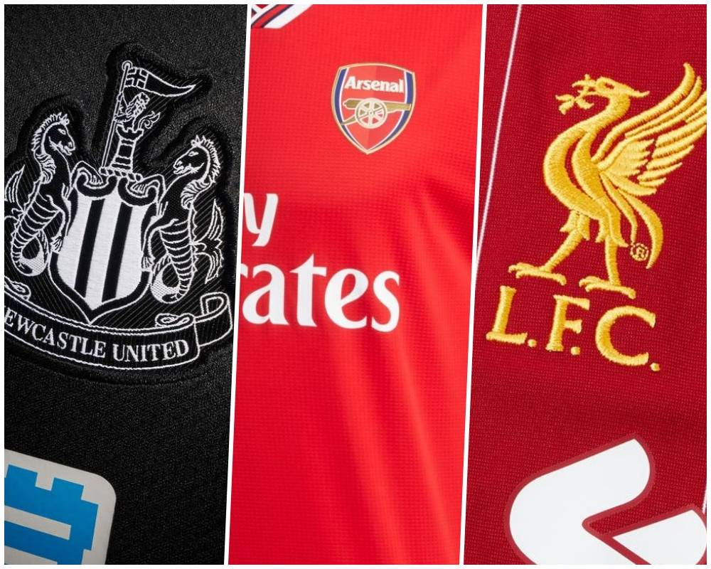
19. Newcastle United

An extremely cheap-looking design with a sponsor which covers a large portion of the front. Newcastle are blessed with some of the best fans in the league, but this will be a kit that many will probably avoid purchasing.
There has been zero thought put into the design and epitomises everything that is going wrong at the football club at this moment in time.
18. Watford

Never been a huge admirer of the colour yellow and this kit did not steer me away from that opinion. They decided to change to a striped design for their home kit, but it looks like two different shirts sowed together to form one.
The colours do not complement each other in the slightest and I feel they should go back to an all-yellow attire to prevent over-complicating the design.
17. Everton

This is a similar design to Chelsea, but slightly more appealing. The patterns on the front of the shirt are unique, but for the wrong reasons.
The Angry Birds logo on the sleeve of the shirt is massive and completely ruins the balance of the top. Not as bad as the blue team in west London, but I still cannot find much to admire about this kit.
16. Southampton

This had potential to be much higher on my list, but the top of the kit completely ruins it for me.
The red and white stripes complement each other well, and have often been successful over the years for the Saints, but I struggle to understand what the bold, black pattern at the top adds to the design.
Another club trying to over-complicate a kit, and unfortunately, it has backfired.
15. Wolverhampton Wanderers

Sometimes simplicity pays dividends, but in my opinion, this kit is nothing to get excited about. Like yellow, orange is a colour I don’t particularly agree with, and having a plain, orange kit was never going to catch my eye.
Wolves produced an excellent 2018/19 Premier League campaign, but this kit is not a reflection of the good work on the pitch.
14. Norwich City

I know I disagree with yellow, but the complementary colour of green had the potential to work well. The plain, green shorts certainly work with the shirt, but again, unnecessary, over the top additions have ruined the kit for me.
The green faded patterns at the top of the shirt are not needed to add quality. Without those patterns, this kit would have been much higher on my list.
13. Burnley

The claret and blue colours complement each other excellently, but there is one thing holding this kit back; the sponsor.
Your eyes are immediately drawn towards the centre of the kit, simply due to the abnormally large sponsor smacked onto the middle of the shirt. Most kits would look better without a sponsor on their shirt, but I cannot admire a kit with such a distracting feature.
12. Tottenham Hotspur

A basic design with no apparent differences from last year.
There are no astounding features on the kit, and again, the large sponsor in the middle of the kit draws your attention directly to the centre rather than the shirt as a whole, especially given the text is red. Nothing exciting about this design.
11. Aston Villa

Villa's home kit for 2019/20 is very similar to Burnley's, but there is one difference which boosts the ranking. In the middle of the shirt, the logo is much more appealing to look at, and does not draw your attention away from the kit as a whole.
Not a great deal of change from last year, and no ambition to improve gives this a mediocre ranking.
10. Sheffield United

The stripe design is one I tend to lean towards, and you will be able to see that from the rankings coming up. The two colours work tremendously well together, but the sleeves give the shirt a distorted look.
It is a good kid, but the off-putting sleeves place it below other striped designs in the rankings.
9. AFC Bournemouth
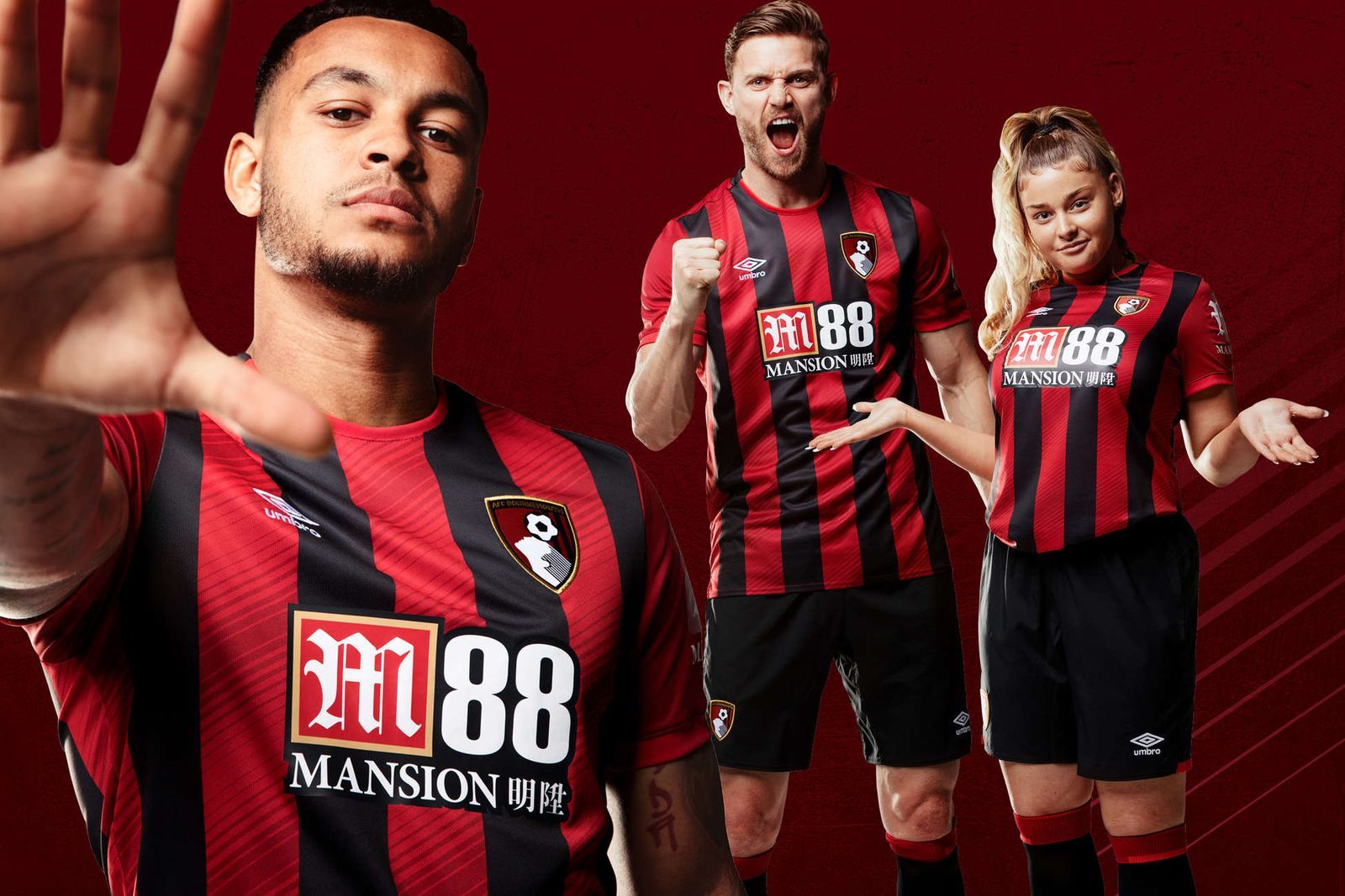
The black and red stripes complement each other excellently and there is something to like about this kit.
The Cherries do not change much with their designs each year, given they use the same striped structure, but if it isn’t broke, don’t try and fix it - a method a few teams have failed to comply with.
The sponsor in the middle is large, but surprisingly fits and blends well enough with the design to make this a good kit.
8. Crystal Palace

The Eagles may have lost one of the players in this picture to Manchester United, but take nothing away from the design of the kit. The red and blue colours are easy on the eye and the white exterior on the sleeves and neck look fantastic.
However, the addition of two Puma logos on the sleeves, as well as putting the logo on the front of the shirt, is a tad excessive.
7. Leicester City

Another kit which has not pushed the boat out in terms of changes or complexity, but that is what puts this attire higher up on my list than most.
The golden stripes at the shoulders of the shirt look great, and the gold Adidas logo complements the blue of the shirt. It had potential to be higher, but the sponsor in the middle brings it down a few places.
6. Brighton & Hove Albion

The blue and white stripes work well together, and the gold Nike logo is a simple, elegant addition which adds to the quality. The American Express logo is just text, and there is no overlay with the stripes, which makes it work.
A kit that has not made major adjustments from last year, and it has paid dividends. The simple changes have been successful, making this a great kit.
5. Manchester City

The current Premier League champions have delivered off the pitch ahead of the 2019/20 season. A classy kit for a dominant club. The light blue of the shirt is complemented by the purple of the sleeves, adding a different dimension from last year’s kit.
Making the sponsor and logo the same colour blends the kit together and, overall, this is an excellent design.
4. West Ham United

Another example of how to correlate colours effectively and create a kit which is easy on the eye. The claret and blue colours are part of the tradition of the club, and the addition of light blue to the top of the shirt works great.
The dark stripes faded into the background could be controversial, but, in my opinion, they work splendidly. The claret outer layers of the sleeves bring the kit together.
3. Arsenal

An impressive design with an equally as impressive announcement video. The simplicity works excellently, and the stripes at the top of the neck add to the class.
There isn’t a great deal of difference from last year’s design, but the simple additions are all the kit needed. Close to being my number one pick, but the sponsor on the sleeves brings it down a couple of places.
2. Liverpool

This club is on the rise, and they have done a fantastic job with producing another classy design for their attire next season. The thin, white, vertical lines add a unique pattern to the design and adds to the class of the kit.
The gold logos are simple, yet effective, and add to the quality. Expect many teams to be blown away at Anfield next season in this kit.
1. Manchester United

It has been a tough time for United fans of late, but this kit will certainly put a smile of their face. The Red Devils have produced an intimidating, all-red attire which is an outstanding design.
The black of the collar and the logos adds to the intimidation factor, and the fans will be praying that this reflects what is to come on the pitch next season. In my opinion, this is the best kit of all the Premier League teams.