With the rescheduling of this year's Euro 2020 tournament meaning, we will now have to wait until next year for the coveted European Championship, this still hasn't stopped kit manufacturers from releasing the uniforms that each country will wear at next years tournament.
Adidas and Puma both released their array of kits for the countries they supply for back during the usual time they would have if the Euro's was still taking place this year, which was November 2019. Nike, however, chose to hold off on its release due to the COVID-19 pandemic and released their kits for the tournament this week. We are also still awaiting Hummel's kits for Denmark and Joma's kits for Ukraine.
There has been a great show from the manufacturers this year, with the ditching of many templates for most, giving us fresh and unique kit designs for each country, with some fantastic away kits to choose from. So, here is our top 10 Euro 2020 away kits...
10. Netherlands
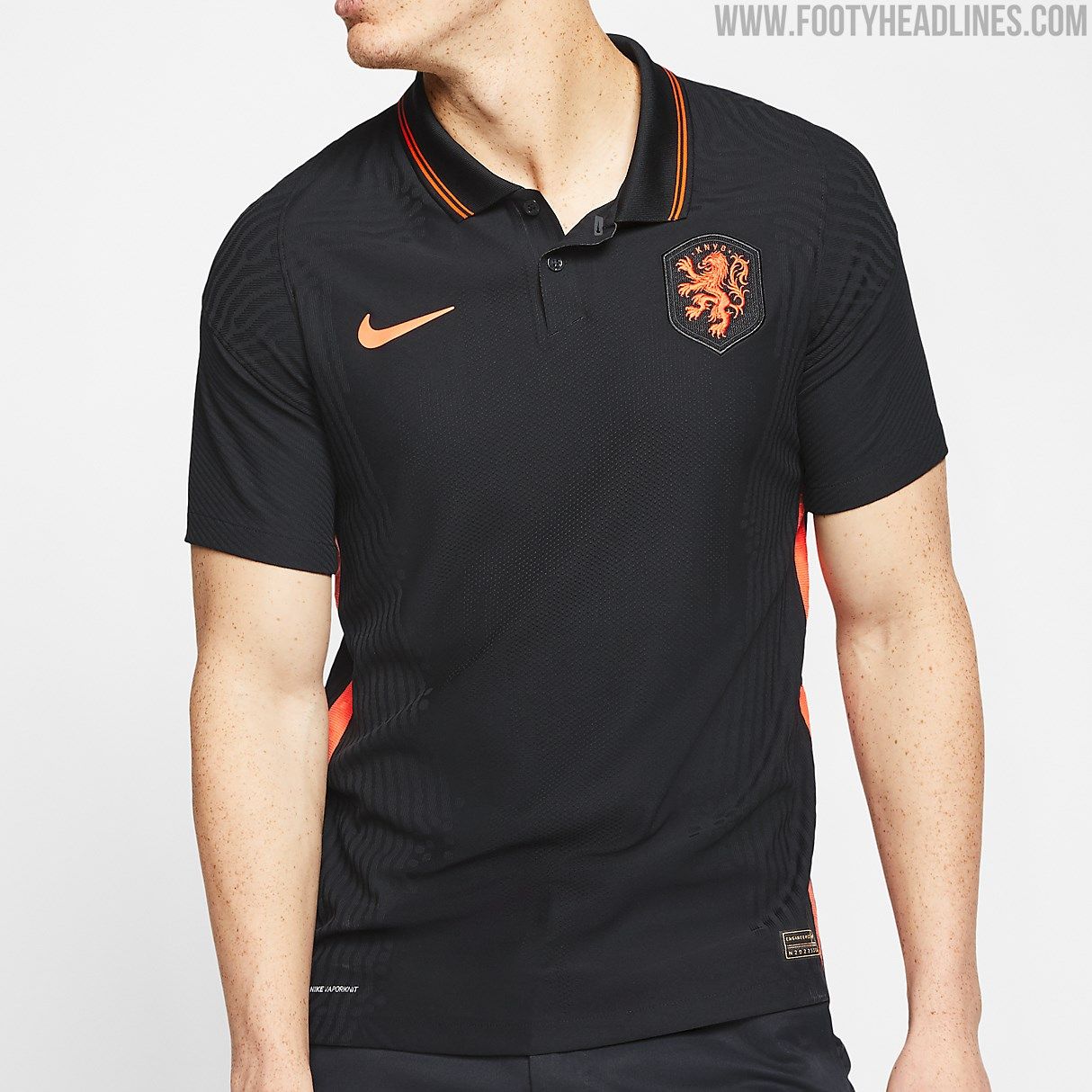
I didn't realise I was reviewing Fred Perry polos? I'm a fan of a button collar, usually, but this just doesn't work in my opinion. The colour scheme is fine, there nothing wrong with that, and works for a Netherland's away kit, but it's just really plain and boring and there is virtually nothing to say about it.
Swap the Nike and Netherland's badge for a laurel wreath and I'd probably wear it down the pub, but aside from that, I wouldn't go for a kick about in it. Much to my disbelief, there are other kits released for the Euro's that are actually worse, but this was the best of a bad bunch and is last in the top 10.
9. Germany
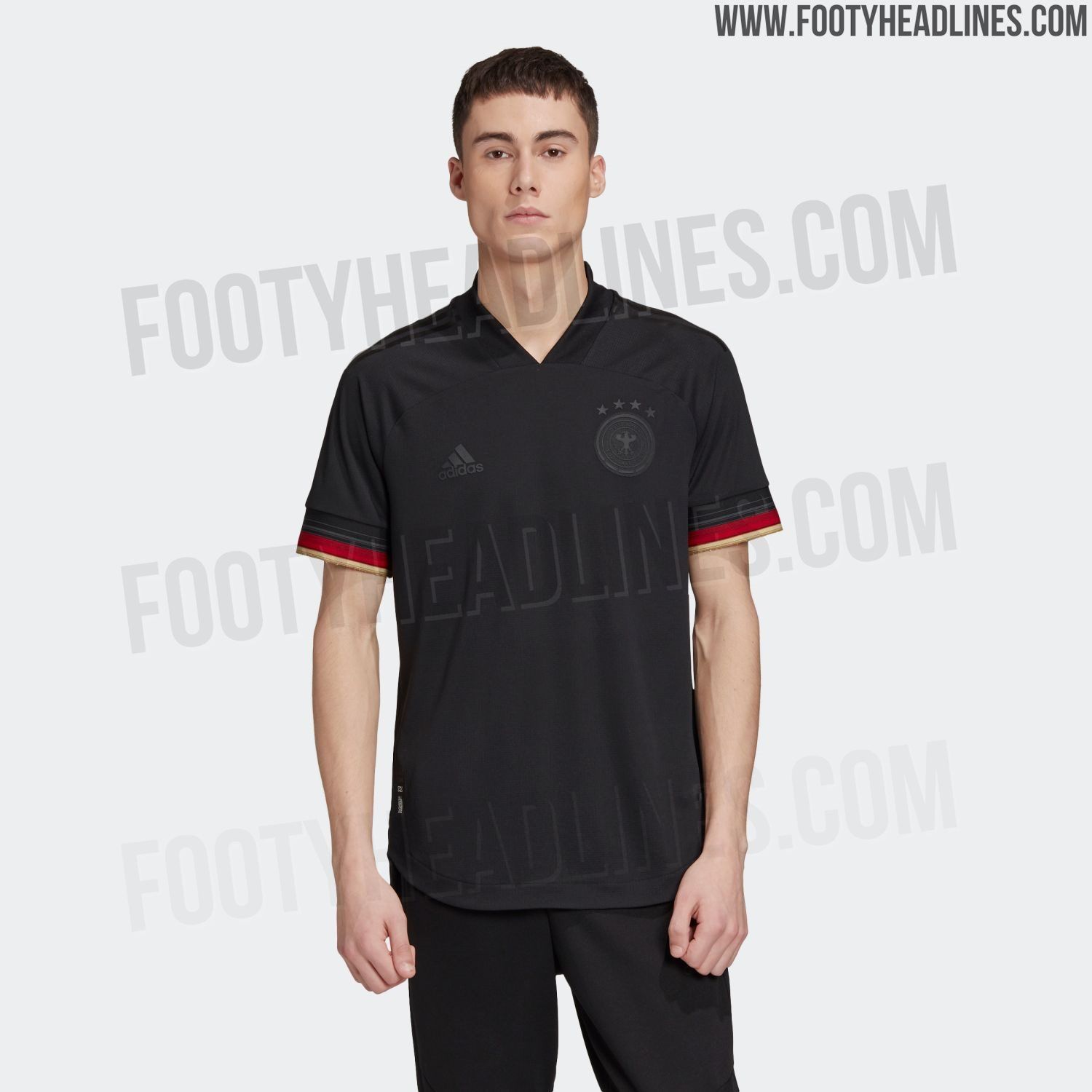
Again, it is very plain and very simple, but this time in a slightly more effective way. Adidas may have stuck with a template for this, but I like the use of the same cuffed sleeves for the away as they did with the home, and have opted for a stealthy all black for the rest of the kit, including the federation badge and Adidas logo.
The fact that the whole base colour is black helps to make the sleeves stand out evermore - making for an effective contrast, and I actually prefer the countries away kit compared to their home. Die Mannschaft have been given a simple but complimentary design here.
8. Sweden
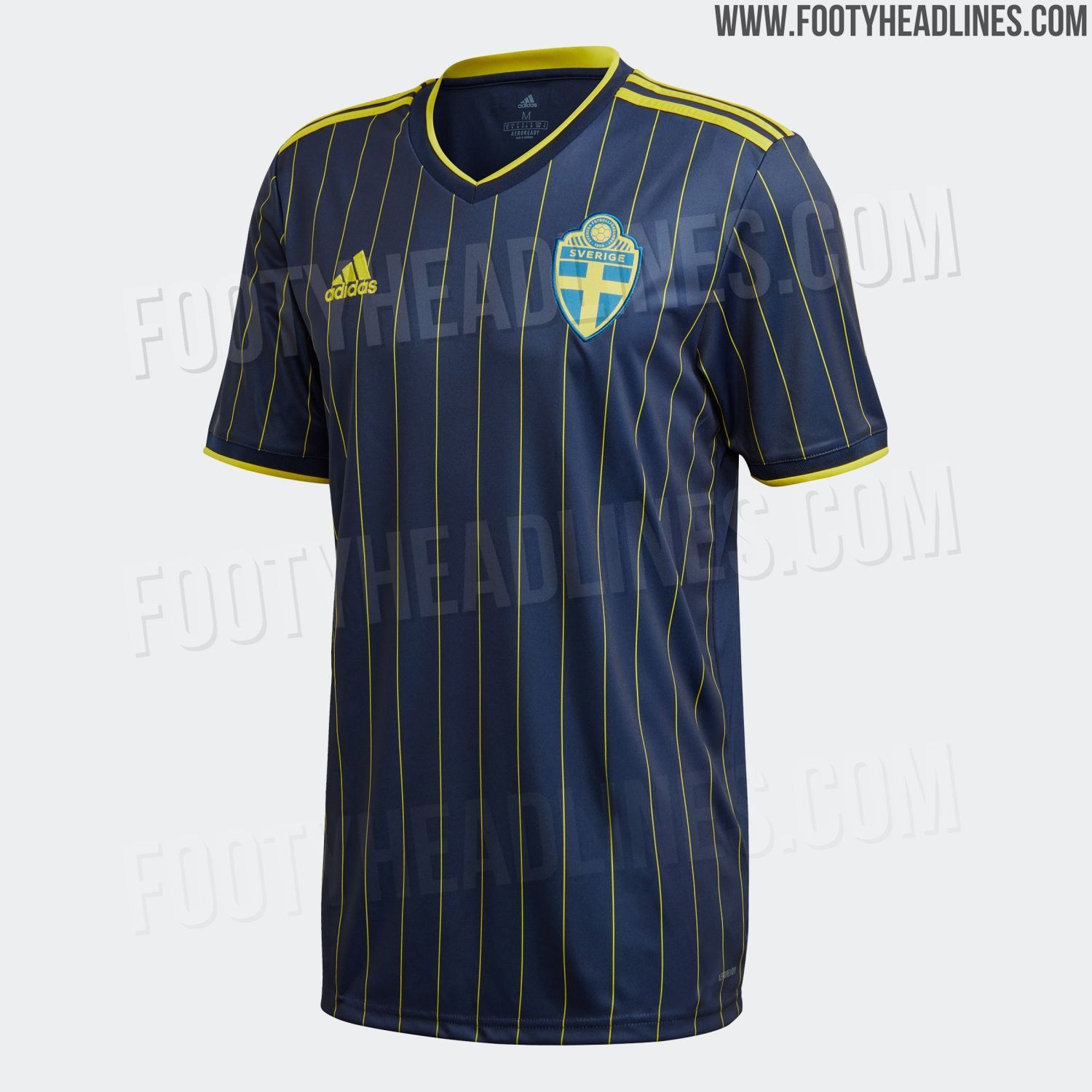
The first and only pinstripe design on the list - Sweden and Adidas have produced a classy approach for their away kit for the Euro's, and I am very much a fan. A dark navy blue base colour features the yellow pinstripe vertically down the kit, along with the yellow trim on the sleeves and collar - it is a simple design but it works well, and I am a sucker for a pinstripe, especially when it is done well.
Adidas have strayed away from the usual template for this one, and thank you to them for doing so - I don't feel the pinstripe design would have worked on the template design, so I'm glad they opted away from that.
7. Austria
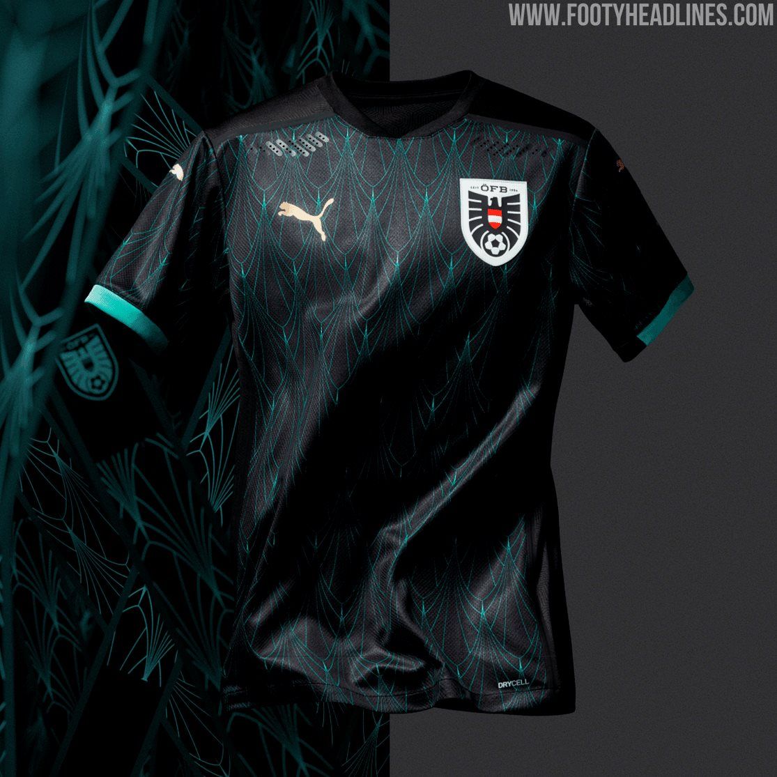
In keeping with Puma's Crafted from Culture series, a theme they have introduced for all of their kits for Euro 2020 - Austria's away kit is something very interesting, and something that I like. The colour scheme and design across the kit is inspired by the Art Nouveau that dominated Austria at the turn of the 19th and 20th century, as stated by Puma.
The colours of the black and teal work incredibly well together, and along with the new federation badge which fits the aesthetic and overall provides the country with a great away kit.
6. Belgium
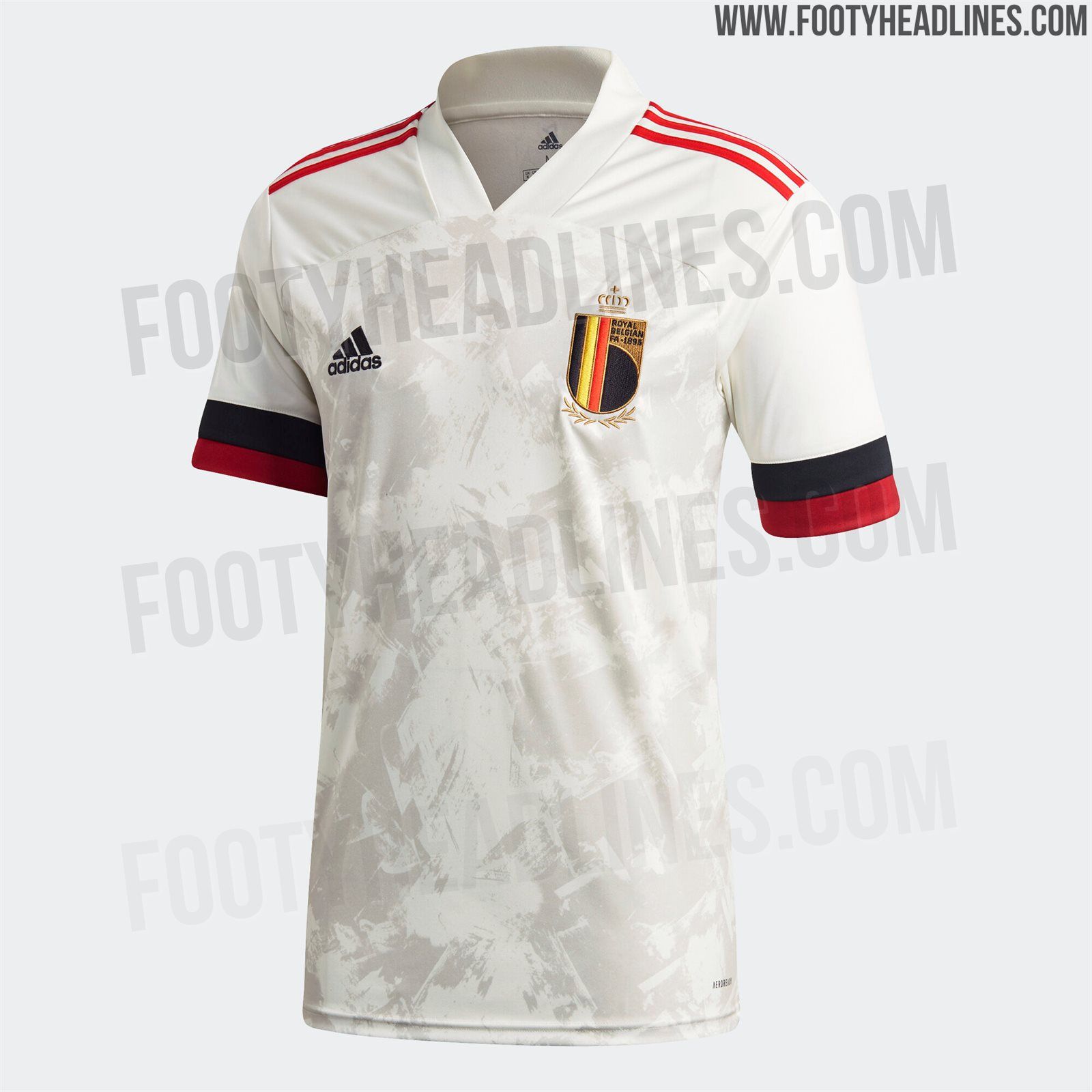
This one is extremely lovely - and is on trend with Adidas' kits they have provided for the Belgian Red Devils for the Euro 2020 tournament. Featuring an off-white/beige base colour, the red and black cuff sleeves, and the new federation badge - an interesting feature is also the brushstroke design across the kit, much like the home kit.
Again, despite the use of the template, the design and colour scheme carries it off well - and unlike the home kit, the print carries on around the back, another team that doesn't need to change the design because of a certain UEFA regulation.
5. Italy
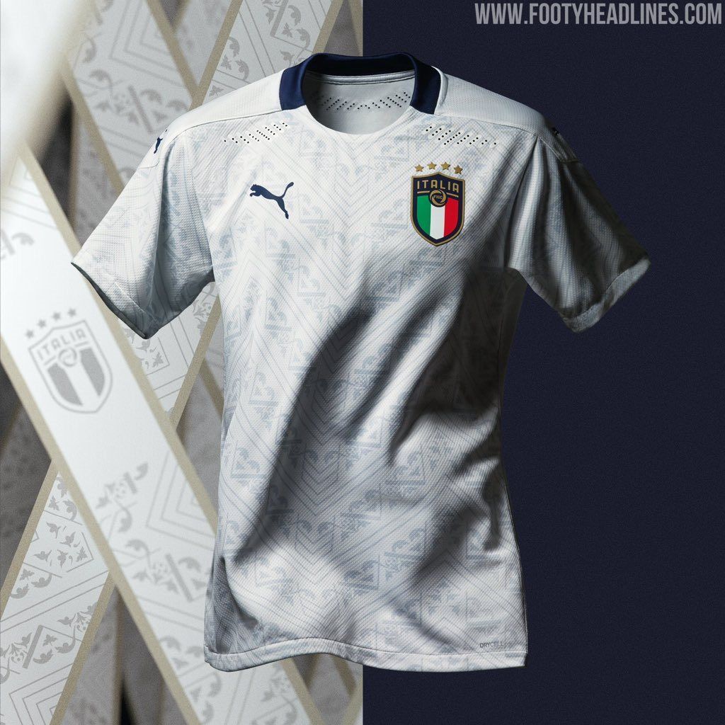
Yes - a big old Renaissance yes. Italy and Puma again following the renaissance era kit designs for the country, with the white base colour featuring a slightly greyed out design across the kit make for a great show from the German manufacturer.
The away kit features a different design compared to the home, giving it a different angle rather than using the same template and just changing the colour which is something Puma should be applauded for.
Overall the Azzuri have been dealt a cracking away kit for next year's tournament, and I love the renaissance inspired patterns that have featured.
4. France
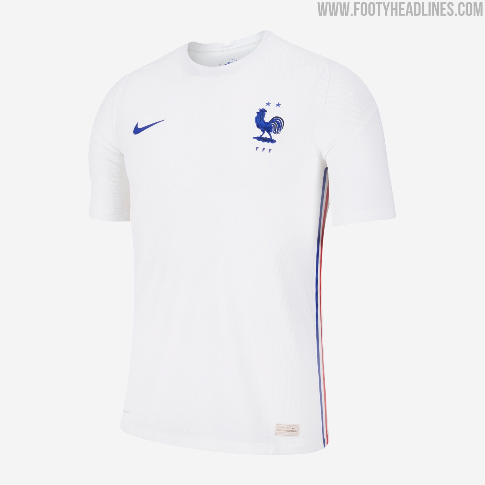
Oh boy, simplicity really is key sometimes, isn't it? Nike and France have teamed up well and produced a fantastic away kit along with their barnstormer of a home jersey.
The simple white may elude most, but the bright electric blue that has been used for the Nike logo and federation badge just hits you in the face in the best way possible. Another great touch is the Blue, White, and Red stripe down both sides of the kit which really stands out if caught from the right angle - but that is all you can say about the kit. For some, this may be a bad thing not having much to delve into or talk about, but that is what makes it beautiful.
It is VERY close to the country's 2015 kit, but almost an upgrade with some detail changes, but I like it, a lot.
3. Switzerland
For some strange reason, I have seen a lot of negative reactions towards Switzerland's away kit for next year's Euro's, but I guarantee that if you stick a Nike swoosh on this kit, opinions will instantly sway.
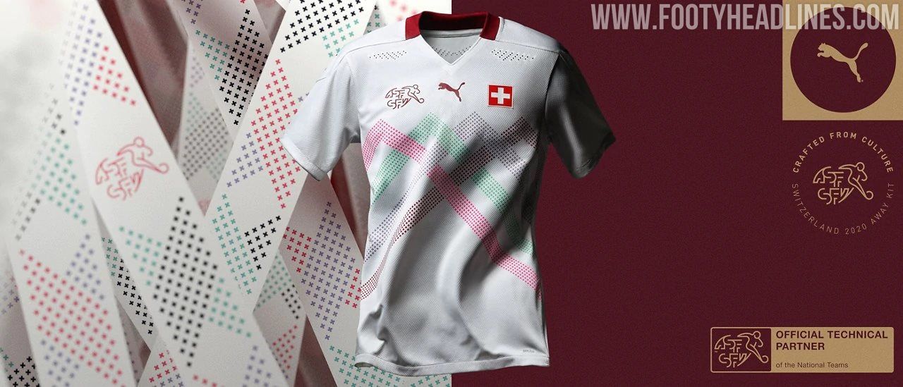
In keeping with Puma's Crafted from Culture approach, the multicolour mountain range that features on the front pays homage to the countries four official languages, as well as the infamous Swiss mountain ranges that dominate the country's landscape. I think it works fantastically well and really complements the base white colour, as well as the simple Swiss flag - all in all it has made for a beautiful away kit for the Swiss.
2. Portugal
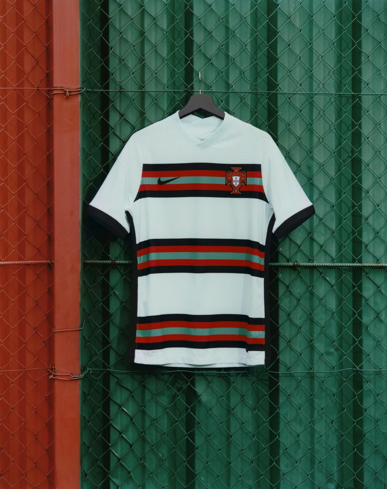
Another opinion splitter, but for me, a kit that will go down in history for all the right reasons. The bright teal base colour is met with the three panels built of the country's flag colours in horizontal stripes, which I think looks great.
One interesting feature is that, due to the aforementioned UEFA regulation where the back of the kit must be kept clear enough to see the player name and number prints, only the bottom panel carries on around the back of the kit, but it actually makes for a very interesting and different design - almost in an asymmetrical type of way. I love it, and it goes almost top for me...
1. Norway
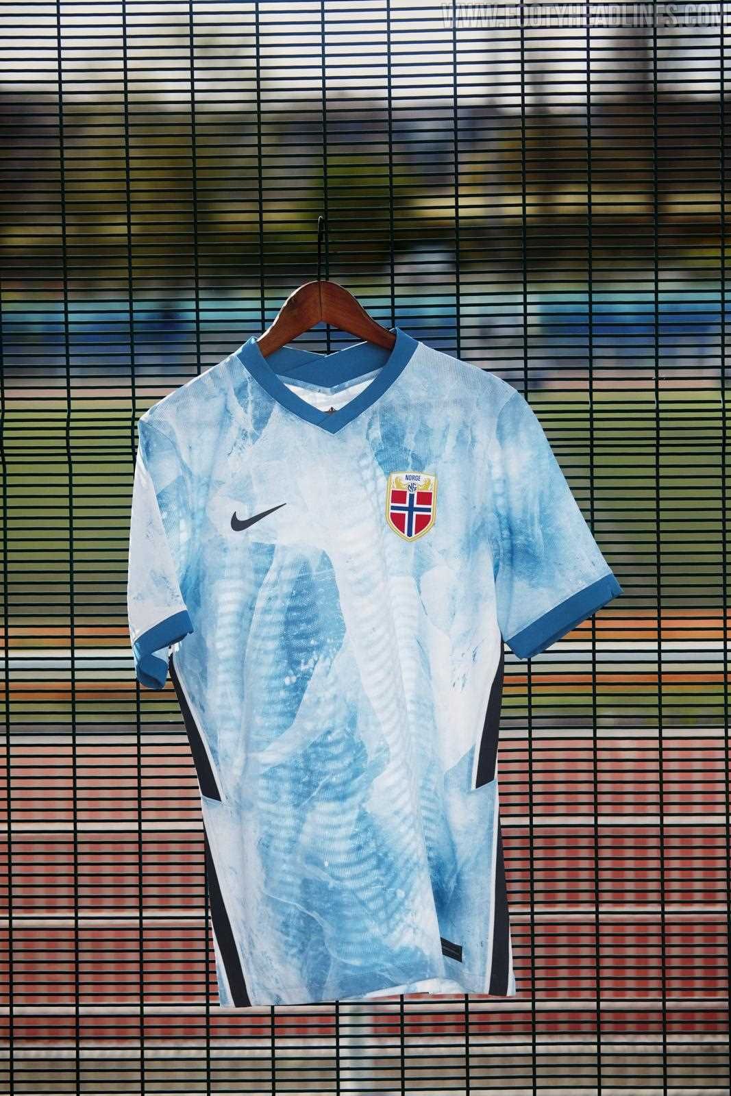
Despite the country not having actually qualified yet, facing two playoff games against Serbia - I just could not ignore this beauty. Norway has been gifted with quite possibly one of the best away kits in international football history, let alone just for next years Euro's.
The kit design and colours are inspired by that or Norwegian nature, reminiscent of icebergs, in celebration of the countries cold and icy terrain. The collar and sleeve trims feature a darker shade of blue for contrast, but it is the Nike zig-zag down the side of the kit that helps for the design to stand out even more, due to the black standing out so much against the design and colour scheme.
It is very similar to Liverpool's away kit for next season, and as you can probably guess that was my favourite Premier League away kit too.

