The return of the Premier League is right around the corner given the impact that COVID-19 has had on football all over the world, with next season starting on the 4th of September compared to the usual start of August. Despite the delay, the annual kit releases for clubs hasn't changed - but where do the new kits rank best to worst?
Liverpool will be looking at retaining the title next season after winning their first title for 30 years, but Manchester City will likely be looking at returning to their perch at the top of the Premier League table that they've become so accustomed to as of late.
There have been mixed opinions on the kits released so far - with fans having mixed attitudes towards the abundance of designs that have been unveiled, with many kits appearing to be massively overpriced for the quality that's been seen, but where do they all rank overall?
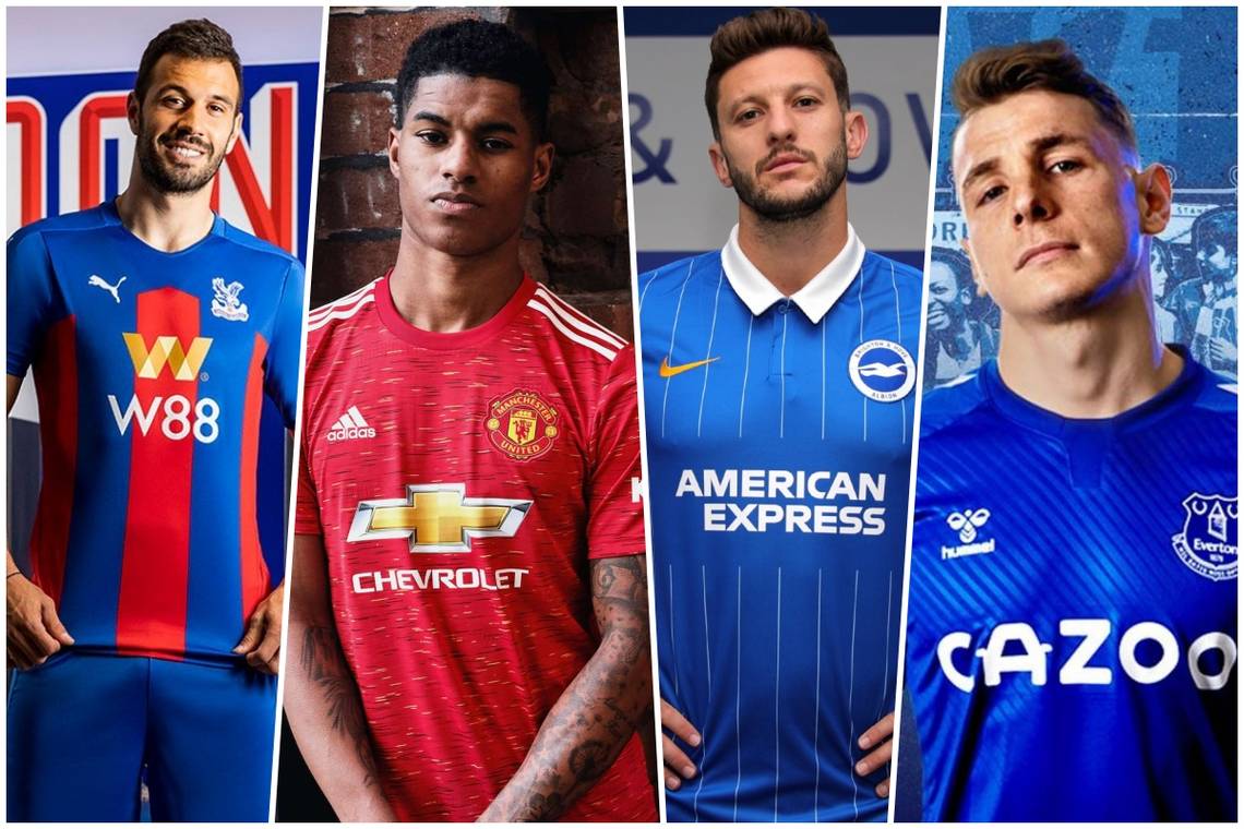
20. Manchester United

Drab. This is easily the worst kit released for me. United last season had surprised people with the use of the badge from the 1999 Champions League winning kit, and it worked well. This season, however, the club has gone west with the design that Adidas has provided, it's awful.
The design looks as though they've just ripped out a bus seat and sewn a United badge on it - and to charge £65 for it just makes it even harder to stomach.
I feel sorry for the Manchester United faithful, they deserved better, and I can't see many rushing to the United shop to buy it.
19. Newcastle United

There isn't too much you can do differently when it comes to Newcastle's trademark black and white stripes, but to do nothing is even worse. Given this is Puma's last designs for the club, I would have hoped they'd have tried to finish with a real statement for the club's home kit.
Instead, they've printed the world's worst looking sponsor onto a humbug and deemed it appropriate to sell to the Newcastle faithful. The club has some of the best and most loyal supporters in the world, and I feel they have been let down with this year's home strip.
18. Manchester City

It's not looking good for the two Manchester clubs - I just don't see why Puma went with this design for the biggest club on their roster?
When I first saw the kit it gave me flashbacks of a six-year-old me getting moaned at by Mrs. Nerris next door for smashing her window whilst having a kick about in our front garden. The trademark sky blue is nice as usual, but the rest of it just screams shattered glass, and not in a good way.
17. Burnley
Another year with another simple design from Umbro - I know if I were a Burnley fan I'd be getting bored of the same repetitive designs year in year out.
The contrast of the sleaves to the body of the shirt is average, and the giant sponsor on the front looks awful. There's not really much you can say about the kit overall, it's just boring.
16. West Ham

It's simple, and it works, but it doesn't stand out anywhere for me. The kit celebrates the club's 125-year anniversary and sticks to the classic claret and blue colours, but much like the Burnley home kit only offers the colour contrast on the sleeves, but with an added alternating trim colours.
The club has apparently released a U18's version which is sponsorless, which actually makes the kit look better - it's always the sponsors that bring down a shirt these days.
15. Wolves

The pattern for the shirt is nice, but the orange doesn't work for it, despite the help of the black contrast with the trademark Adidas stripe piping on the shoulders. It looks like Adidas attempted a Netherland's Euro '88 inspired design, but this just doesn't work too well.
It's rare that orange kits look good, and Wolves have missed out on this one I feel - and again an awful sponsor just adds to pain for the club's fans who will have to go around looking like a moldy Wotsit if they purchase the strip.
14. Leeds

Leeds are finally back in the Premier League, personally where I feel they belong. Despite the big occasion, their first rumoured Premier League home kit is as safe as it can get.
The trademark white is obviously a go too with a Leeds home kit, but I feel that Adidas should have gone with something a bit bolder for the club's long-awaited return, but instead has just added the minimal blue lines to the sleeve and shoulders - an average kit at best, but not the worst.
13. Leicester

The use of the standard Adidas template was expected, but what I really like is the gold band on the cuffs of the sleeves. There's just something about it with either side.
The rest of the kit is pretty simple and doesn't leave much to be desired, but that slight gold detailing put's it above the other Adidas designs previously mentioned.
12. Sheffield United

The Blades have done okay with this one, only okay though - the kit again sticks to the typical templates used by the German manufacturer, but the use of the club's colours has been done well for the design - although it looks as though the neck and shoulders were nicked off of a Fulham kit.
Again the thick Adidas cuffs on the sleeves are the best part of the kit, along with the black V collar to add contrast to the fairly vibrant white and red stripe that is synonymous with the club.
11. Everton

Hummel has always been a favourite of mine, and there first design for the Toffees is a good start to life with the club. The classic Hummel V logo down the shoulders look's as good as ever, but the slight verticle stripes across the face of the kit look really sleek with the shiny darker blue, as well as the white cuffs on the sleeves.
The only downfall to the kit is the sponsor as I can't stand their advert on the telly.
10. Aston Villa

Kappa manages to make some great shirts - and I rather like their take for Villa this year. The usual colours remain as you'd expect, but the long Kappa sleeves look good and the closer details to the fabric of the kit are something special, with a slight pinstripe that looks good.
Again though, the sponsor brings it right down and I'm already getting a headache thinking about that advert.
9. West Bromwich Albion

Another welcome back to the Premier League for the baggies - and it's good to know they'll be doing it with a kit that actually works.
I really like the stripe style that they've used, rather than a generic design much like the Newcastle stripes. The reference to the barcode in their promotion of the kit is rather comical - it seems to be a running theme but again, the sponsor is the let down for this kit. I'm sure the West Brom fans will be happy overall though.
8. Southampton

This is where thing's start to get better. Just look at that diagonal stripe - like a big white seatbelt ready to clip Saints fans in for another crazy season in the Premier League with the Alpine Klopp.
I really like this kit, the white and black contrasts on the hem of the sleeves are great, along with the black collar detail with again, the slight white trim - also the little touch of the Southampton scarf with the words 'We March On' in the inside collar is smart. Under Armour has always done a pretty good job with the Saints, and they've pulled off another great one here.
7. Crystal Palace
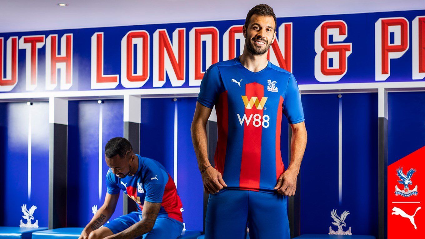
I don't know what it is, but there's something about this kit that just draws me in. The way the stripes don't cover the whole of the kit, and the way they stop in that V, along with the new sponsor that doesn't actually look that bad with the design.
The club was always going to have the synonymous colours and stripes that they always usually have, but what Puma has done to make it that little bit different sits well with me - it just looks really smart. Palace fans, be happy!
6. Chelsea

Simplicity is key sometimes - and Nike has done just that with Chelsea's new home kit. It's a very captivating shade of blue, with a faded zig-zag pattern going sideways across the kit. The darker blue collar and sleeve trim look's lovely, and the sponsor oddly works alright with it.
We always knew it was going to be an all-over blue kit, but the subtle details here and there by Nike are a great addition.
5. Brighton

BUTTON COLLAR. TIDY.
The thin white pinstripe, decent sponsor, gold Nike logo, white sleeve cuffs, a deep royal blue - well done Brighton, and well done Nike.
I can't fault much about this kit, I love it - and if I were a Brighton fan I'd have already bought about ten of these.
4. Fulham

Sadly Fulham's kit has not been released at this moment in time, but some of the rumours and concepts flying around are very interesting.
This rumour/concept seen on Twitter would make for one of the best kits in the league if anywhere near accurate - it looks amazing, I can picture Mitrovic wearing it now, like a big old Serbian Zebra. Lovely.
3. Tottenham

Unlike last season Spurs have made a top-four finish - and with a lovely kit indeed.
The classic white has this funky greyed out print over it which looks really good, and the contrast sleeve colours between the white and the navy blue works wonders. My favourite part is the asymmetric trim down each side of the kit, which has a neon yellow stripe alongside the aforementioned navy blue, and the same with the collar.
Great stuff from Nike again, and Spurs fans will be over the moon with it.
2. Arsenal

Arsenal, second best once again.
The kit is fantastic - the retro zig-zag print just looks great, especially given the different shades of red used for it, and the sponsor always works as it's a great font and not too big and bold. I love the chunky cuff sleeves that Adidas have been doing this year, but just overall this kit is almost perfect.
The Gunners fans will have no doubt spent all their money on it already - and I'm looking forward to seeing it on the pitch next season.
1. Liverpool

No.1 in the league, and No.1 with the kits - no surprise there then.
All jokes aside it was really difficult to choose between this and the Arsenal kit, but remember before when I said about how simplicity can be key? That's exactly why the Reds have the best home kit in the league.
The red is actually darker in person, and the sponsor just looks so neat - along with the white and this sort of rich emerald green on the trim of the collar and sleeves just looks sublime. The vaporknit kit adds to the magic due to the swirl pattern details along the shoulders, arms, and down either side of the kit.
Nike's first kit for the club is a home run for me.